Warm, modern websites with an editorial bite.
We design and ship premium, production-ready experiences for founders and teams who want clarity, craft, and confident conversion — without the noise.

Design with restraint. Detail with bite.
A small menu, executed deeply. Every deliverable is tuned for readability, hierarchy, and calm conversion — with micro-interactions that feel expensive.
Brand direction
Type pairing, color palette, tone, and layout rules — packaged as a usable mini-system for web and marketing.
Explore scopeWeb design + build
Responsive pages with strong hierarchy, crisp spacing, and clean component systems — built to ship, not sit.
See examplesEditorial layout
Landing pages, case studies, and newsletters that read like a magazine — with scanning cues that guide action.
Our approachPerformance polish
Motion restraint, accessibility checks, image strategy, and interaction tuning — the “this feels premium” layer.
Add-onsDesign systems
Tokens, components, and usage guidance that keep future pages consistent — even when multiple hands ship.
SystemizeCopy + messaging
Tight value props, section logic, and CTA language designed to reduce friction and sharpen your narrative.
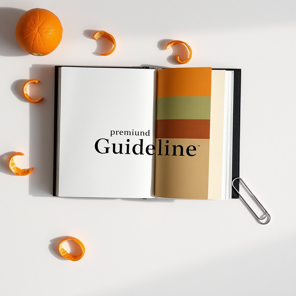
Refine messageA gallery of calm, sharp decisions.
Each project balances editorial structure with citrus energy — warm accents, legible type, and interfaces that breathe.
Four steps. No fog.
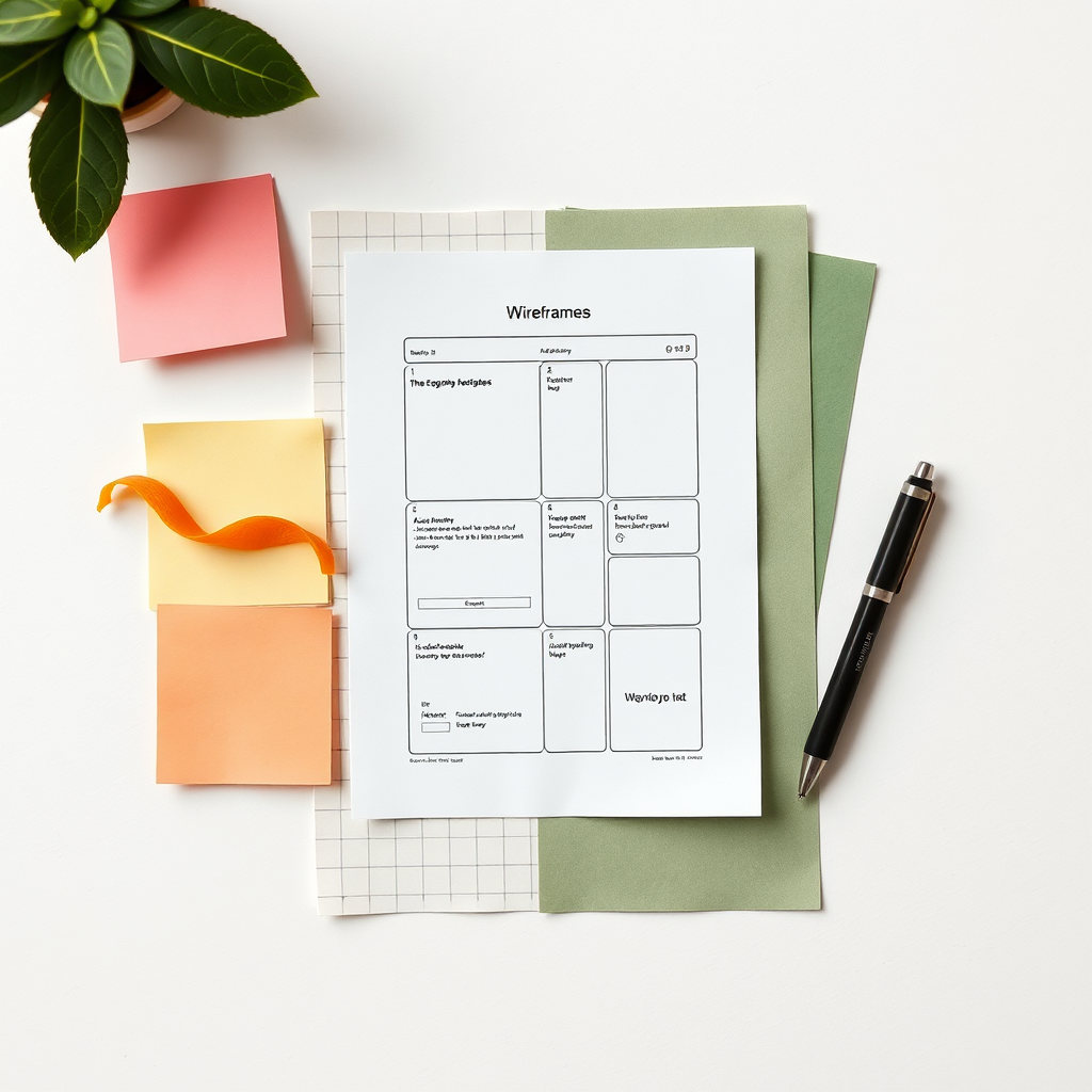
A focused sequence that keeps decision-making crisp: define, design, build, and ship — with room for polish where it counts.
We map your story, audience, and desired action. You’ll get a concise page outline and tone direction before pixels.
Type, spacing, and components are defined first, then assembled into pages with an editorial rhythm.
Responsive build with subtle micro-interactions, accessibility checks, and performance-minded implementation.
We ship, monitor, and refine. You get handoff notes and a support window for adjustments after launch.
Loved for the calm, sharp clarity.
Short feedback, big signal: pacing, taste, and the kind of polish that reads as “premium” instantly.

“The hierarchy is immaculate. Our story reads cleanly, the CTAs feel natural, and the site finally matches the quality of our product.”

“They built a system, not just pages. Updates are effortless now — spacing, type, and components stay consistent across everything.”

“Tasteful motion, zero clutter. The final site feels like a magazine you can navigate — refined, warm, and immediately credible.”

A small studio with a precise standard.
Citrus Burned is built around a simple idea: most “modern” websites don’t feel modern — they feel crowded. We use editorial structure, warm restraint, and production-ready craft to make your product feel inevitable.
Layouts that guide the eye — without yelling.
Components that scale beyond one launch.
Contrast, focus states, and readable type.
Focused rounds and crisp milestones.
Choose a scope that fits your timeline.
Transparent packages designed for fast decisions. Need something bespoke? We’ll tune the scope without bloating it.
A focused landing presence for early traction.
- 1–2 pages (landing + legal)
- Mini style kit (type + color + spacing)
- Responsive build + basic SEO
- 14-day post-launch support
Full site + system for serious credibility.
- 4–6 pages + case study template
- Component system + tokens
- Micro-interactions + accessibility pass
- Performance & image optimization
- 30-day post-launch support
Multi-page marketing + system for teams.
- 8–12 pages + modular sections
- Advanced design system & governance
- Content migration support
- Analytics events + QA checklist
- 60-day support + training session
Ready to make it feel inevitable?
Send a note with your timeline and what you’re building. We’ll reply with next steps, a scope outline, and a clear estimate.